Supplementary code for SHAP in the wild.
In my last blog, I wrote about the theoretical underpinnings of SHapley Additive exPlanations (SHAP). In this blog, we will see to a couple applications: interpreting a support vector machine model and a transformer.
I. Interpreting Breast Cancer Predictions.
Machine learning (ML) models, especially in domains such as health, benefits from being transparent and understandable. In this section, a model was trained on the breast cancer dataset, a common benchmark in ML, afterwards SHAP was used for XAI.
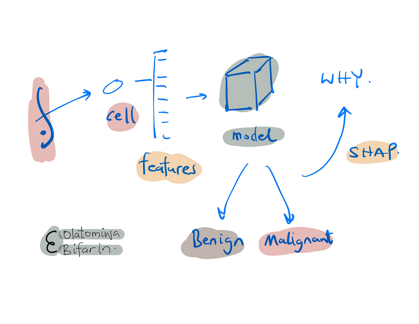
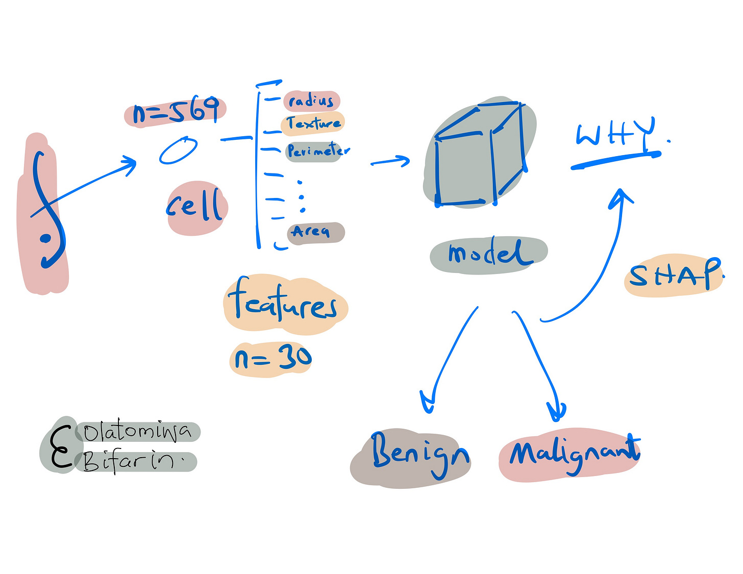
The dataset consists of 569 samples with 30 features each, derived from breast cell nuclei images. Here, it will be used for binary classification – to distinguish between benign and malignant breast cancer tumors.
Here are some of the features.
Radius: Mean of distances from the center to points on the perimeter of the cell nucleus.
Texture: Standard deviation of gray-scale values in the cell nucleus.
Perimeter: Mean size of the core tumor.
Area: Area of the cell nucleus.
Smoothness: Mean of local variation in radius lengths of the cell nucleus.
Going forward, the first 10 features were selected for simplicity. After splitting the data into training and test sets, I standardize the features. I then train a Support Vector Machine (SVM) classifier with probability estimates.
# Load the breast_cancer dataset
data = load_breast_cancer()
X = pd.DataFrame(data.data, columns=data.feature_names)
y = data.target

# Select only the first 10 features for simplicity
selected_features = data.feature_names[:10]
X = X[selected_features]

# Split the dataset into training and test sets
X_train, X_test, y_train, y_test = train_test_split(X, y, test_size=0.2, random_state=42)

# Standardize the data (important for logistic regression)
scaler = StandardScaler().fit(X_train)
X_train = scaler.transform(X_train)
X_test = scaler.transform(X_test)

# Train a SVM classifier
clf = svm.SVC(probability=True, random_state=42)
clf.fit(X_train, y_train)
To assess our model, Area Under the Curve (AUC) and accuracy was used, with a score of 0.99 and 97% respectively. Which basically confirms the model's high predictive power.
# Predict on the test set
y_pred = clf.predict(X_test)
y_pred_proba = clf.predict_proba(X_test)[:, 1]

# Calculate AUC
auc = roc_auc_score(y_test, y_pred_proba)
print("AUC: {:.2f}".format(auc))

# Calculate accuracy
accuracy = accuracy_score(y_test, y_pred)
print("Accuracy: {:.2f}".format(accuracy))
SHAP's power lies in many aspects, one that is particularly useful is its ability to break down the prediction for each instance, attributing importance to each feature leveraging on the principle of additivity. I use Kernel SHAP for interpretations.
Two important points and then we look at some results.
(i) Creating a Background Dataset: A subset of our training data (summarized via k-means clustering) was used for the SHAP values computations.
(ii) Generating SHAP Values: SHAP values were calculated for the test dataset.
#background dataset
X_train_summary = shap.kmeans(X_train, 10)
# Use Kernel SHAP to explain the model
explainer = shap.KernelExplainer(clf.predict_proba,
                                 X_train_summary,
                                 link='identity',
                                 seed=42)
shap_values = explainer.shap_values(X_test, seed=42)
Beeswan Plot.
The beeswan plot visualizes the impact of the 10 selected features as measured by SHAP values.
Each dot represents a datapoint (a patient's tumor characteristics in this case):
Features are listed on the y-axis, with "Mean Concave Points" at the top, indicating that it is the most impactful feature.
The x-axis represents the SHAP value, which quantifies the impact on the model's output. A higher absolute value indicates a higher impact on the model prediction.
Dots are color-coded, with red representing lower feature values and blue representing higher feature values.
The position of the dot on the x-axis shows the direction of the feature's impact on the model's prediction. Dots to the right implies a feature contributes to predicting malignancy, while dots to the left implies a benign tumor.
The darkness of blue dots to the right for "Mean Concave Points" implies that higher feature values of concave points significantly increase the likelihood of the model predicting the presence of cancer. Conversely, red dots to the left suggest lower values decrease that likelihood.
A summarized bar plot version of the beeswan is presented below, where the features are plotted against the mean SHAP value.
Force Plot.
Force plot allows us to visualize the contribution of each feature to a particular model prediction, so local interpretations.
In this plot:
The x-axis indicates the probability space of prediction.
The base value (the average model output over the dataset used for training) is the starting point for the prediction.
Each feature’s impact is shown as a colored segment that pushes the base value either to the left or right.
Red segments represent features that push the prediction higher (towards a higher likelihood of cancer), while blue segments push the prediction lower (towards a lower likelihood of cancer).
The length of each segment corresponds to the magnitude of a feature's impact. Longer segments have a larger impact on the model's output.
The features are listed at the bottom, with their corresponding feature value.
This particular force plot indicates that, for this instance, features such as "Mean Texture" have significant contributions to the model's prediction. The accumulation of red segments suggests that the overall prediction is pushed towards a higher likelihood of cancer, with a predicted probability of 0.75.
Decision Plot.
Decision plots visualize the cumulative effect of features on the model's output for each instance in the test set.
Here's a description of the plot:
The features are listed on the y-axis, with increasing importance from the bottom to the top.
The x-axis indicates the probability output, where > 0.5 is the malignant prediction, and vice versa.
Each line represents one instance from the test set, starting at the base value (the average model prediction across all instances) and ending at the final model output after accounting for all feature contributions.
For each instance (i.e., the line plot), each feature pushes the line left or right as it moves upwards, indicating its positive or negative impact on the final prediction.
The final position of each line at the top of the graph corresponds to the final prediction of the model for that particular instance, after all the feature contributions have been accounted for.
Next, let’s move to our text generation example.
II. Explaining Language Model’s Text Generation.
In the earlier example we used KernelSHAP, here we are going to use PartitionExplainer behind the hood. As I have stated in my earlier blog, there are different implementations of SHAP, depending on the kind of models to be explained and of course, the data modalities.
First, I set up the model, here I use gpt2, a predecessor of the now widely successful gpt4.
model_name = "gpt2"
# Load tokenizer and model from Hugging Face Hub
tokenizer = AutoTokenizer.from_pretrained(model_name, use_fast=True)
model = AutoModelForCausalLM.from_pretrained(model_name)
# GPT is a decoder-only model
model.config.is_decoder = True
Various parameters for text generation are defined.
model.config.task_specific_params["text-generation"] = {
    "do_sample": True,
    "max_length": 50,
    "temperature": 0,  # to turn off randomness
    "top_k": 50,
    "no_repeat_ngram_size": 2,
}
Next, I prepare the input sentence, and the SHAP Explainer is initialized with the GPT-2 model and tokenizer. SHAP values are then generated for the input sentence, which will quantify the impact of each token on the model's output.
input_sentence = [""Hot days are not good for your health. The best way to prevent your body"
explainer = shap.Explainer(model, tokenizer)
shap_values = explainer(input_sentence)
Now, let’s see some results.
Here's a breakdown of this force plot:
SHAP Values: Each colored fragment represents a SHAP value for a particular token in the input text. These values measure the impact of each token on shifting the model's output from the base value.
Input Tokens: Below the plot, the tokens of the input text are displayed. In this example, the input is "Hot days are not good for your health. The best way to prevent your body".
Output Tokens: The output section above the plot shows the text generated by our gpt2 model. In this case we have, "from getting sick is".
In summary, the force plot visualizes how each piece of the input text/tokens influences the model to generate the specific output. From the figure above, the model is more likely to generate the word "sick" given the input tokens provided, with "health" being a particularly strong token pushing the prediction towards generating "sick".
This kind of visualization helps in understanding the decision-making process of language models, which is essential for tasks like text generation where context and word choice are critical.
For a potentially clearer visualization take the following:
shap.plots.bar(shap_values[0, :, "sick"])In this figure we are looking at words/tokens that influences the generation of the word “sick”, and clearly, we see that ‘health’ and one ‘your’ makes it more likely that the model output ‘sick’, while ‘Good + for’, and a full stop “.” makes it less likely for the model to generate ‘sick’.
In another example:
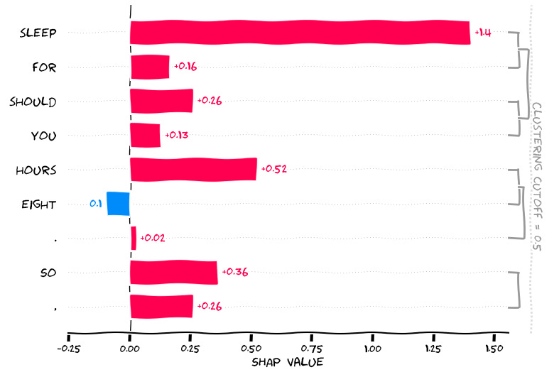
input_sentence = ["You should sleep for eight hours. So,"]
shap_values = explainer(input_sentence)
The input token: “You should sleep for eight hours. So,”
GPT2 gives us “if you ‘re not feeling well, you should sleep …”
Now let’s see why the word ‘feeling’ was generated, and you can deal with the interpretations yourself which should be straightforward at this point.
That marks the end of this blog, and my explainable AI adventures, at least for a while.
If you like to read more about SHAP applications in biomedical domain, see some of my recently published papers.
Interpretable machine learning with tree-based shapley additive explanations: Application to metabolomics datasets for binary classification. PLoS One. 2023 May 4;18(5):e0284315. doi: 10.1371/journal.pone.0284315.
Automated machine learning and explainable AI (AutoML-XAI) for metabolomics: improving cancer diagnostics. bioRxiv [Preprint]. 2023 Oct 31:2023.10.26.564244. doi: 10.1101/2023.10.26.564244.
Next on the Epsilon, we will start looking at Transformers, Generative AI, and related topics.


